Designing a data viz system and companion app for a next-gen charting library
In the past few years, the team of ZingSoft↗ has been developing a new data viz product soon to be launched. I’ve been involved in the design of such a tool since 2022 as the sole designer and part of the remote team.
Moving from creating chart demos and components, I arrived at the definition of a data-viz-oriented design system for the new product. The system, which is still growing, encompasses basic visual elements, icons, domain-specific components, responsive layouts, and much more. Working in close collaboration with developers, my role isn't limited to visual proprieties and also includes working on interactive features. More recently, I've focused on 1) the architecture and design of a related APP, and 2) the development of a "capsule" visual ID for the product launch.
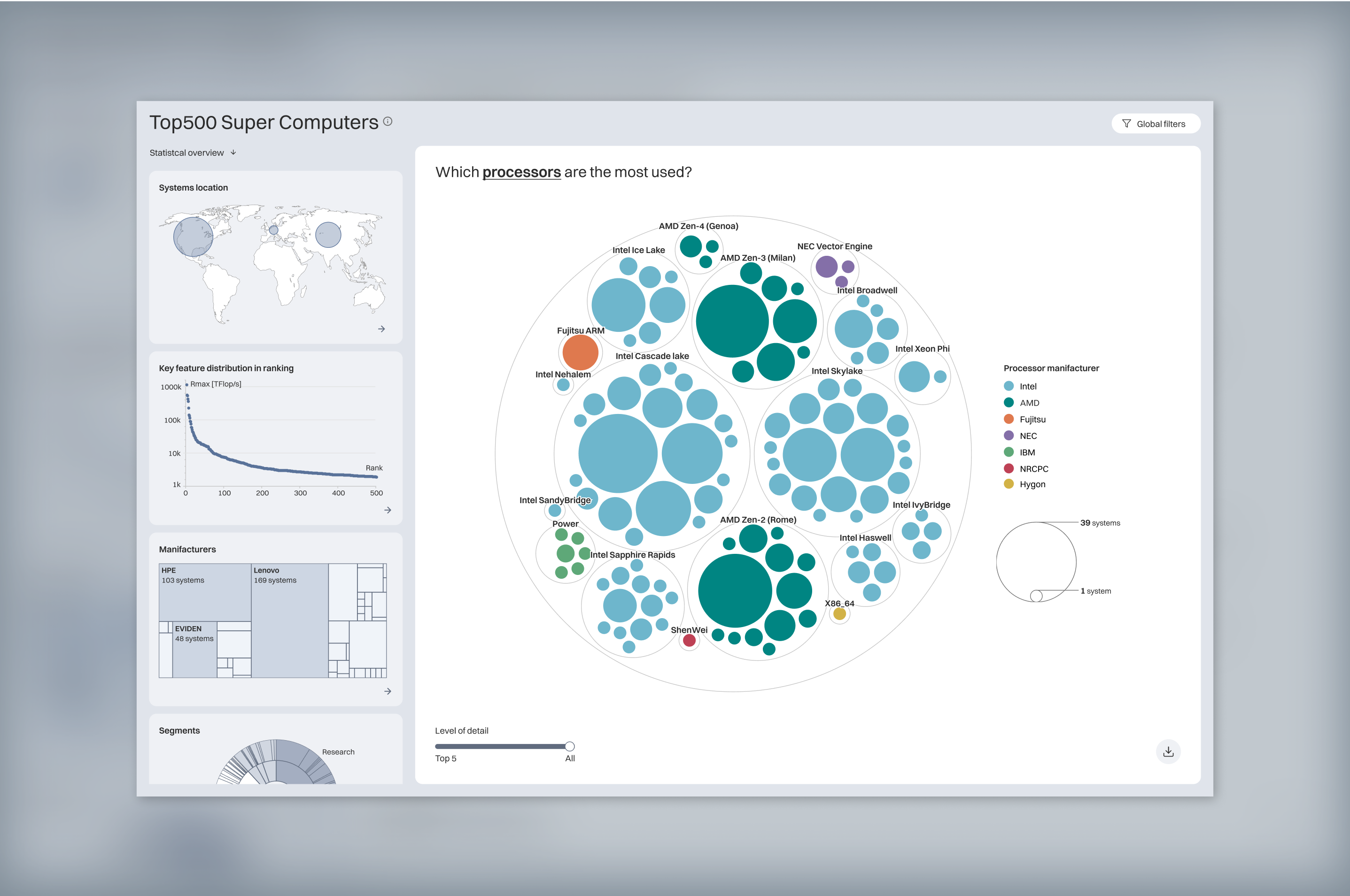
Image and video of a dashboard demo designed to test the capabilities of the upcoming product, based on TOP500 Super Computers list.
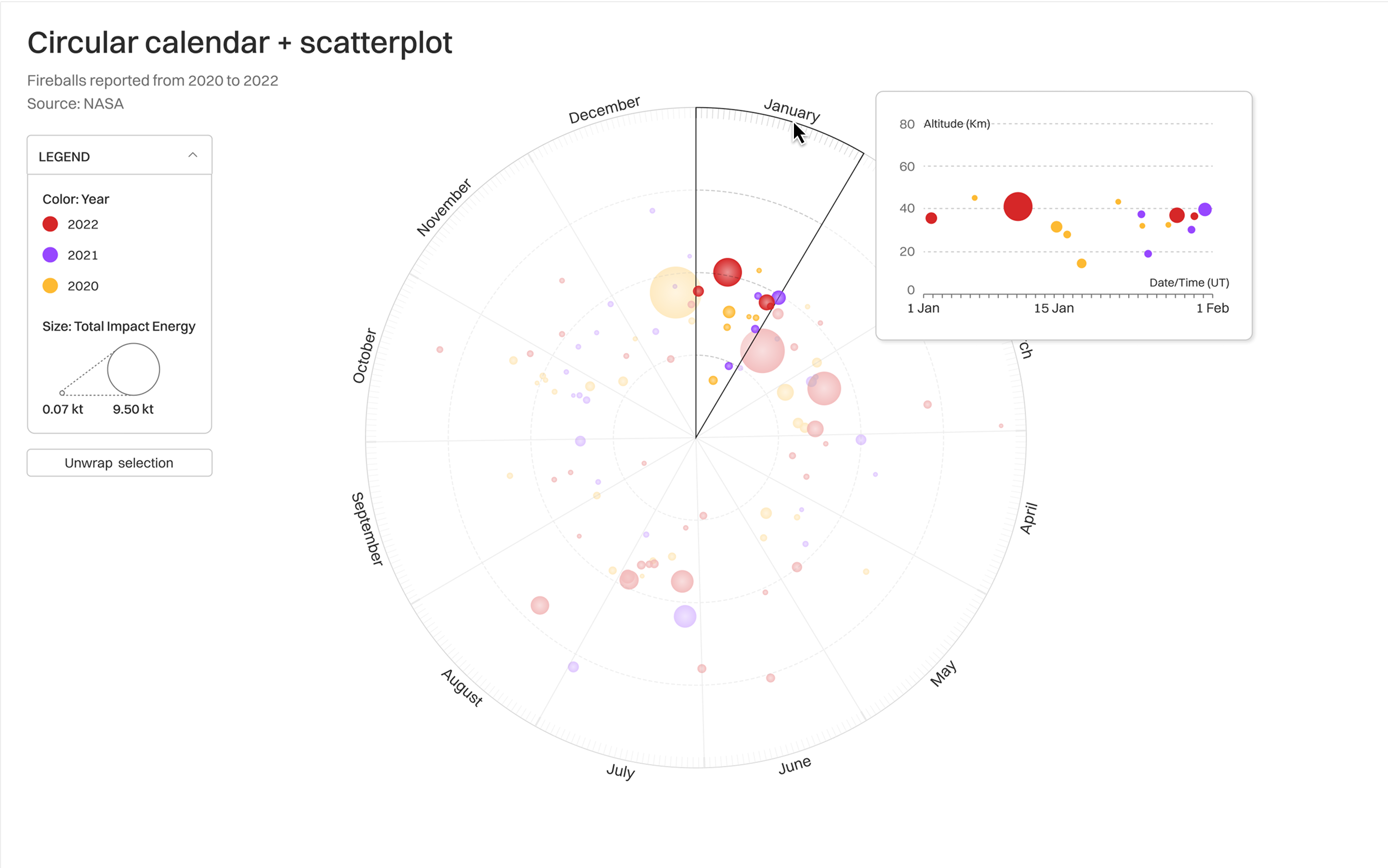
Circular scatterplot based on NASA fireballs' data. It's possible to visualize a section of the chart as a new linear visualization.
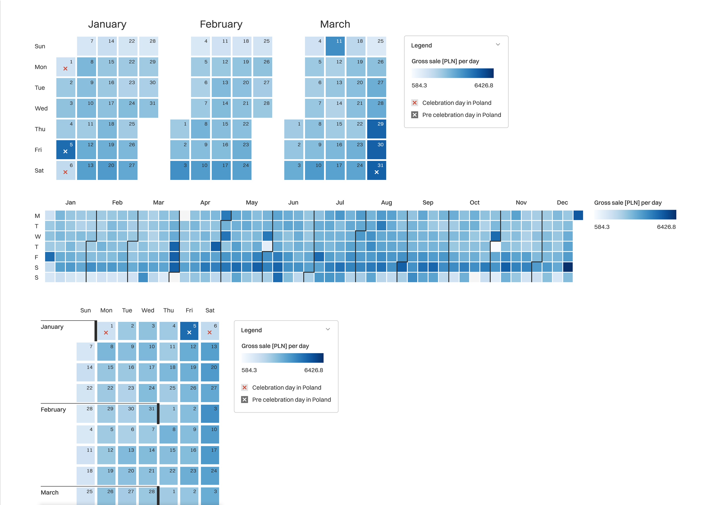
An example of visual variations designed for a chart type, in this case, a calendar heatmap.
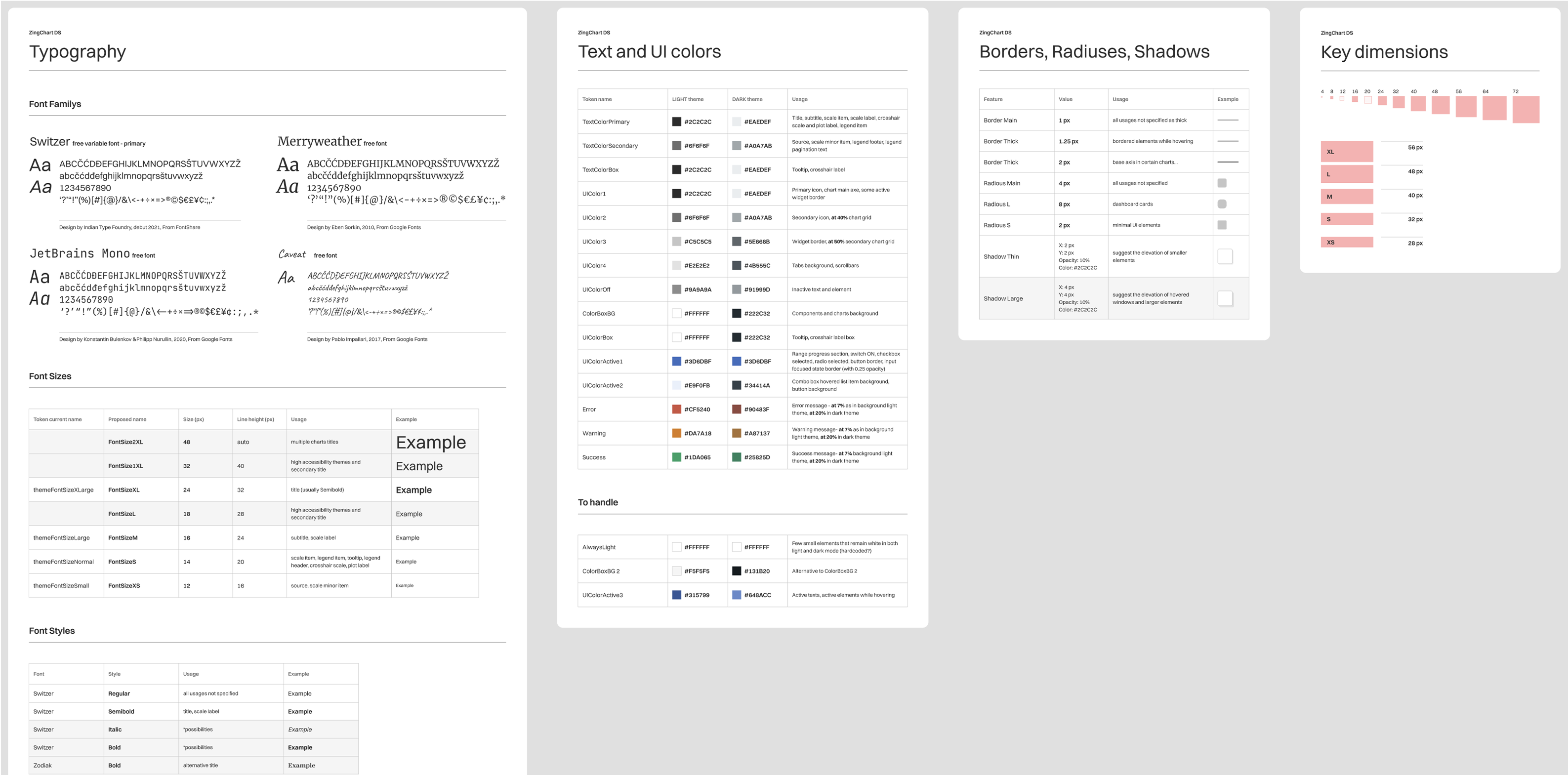
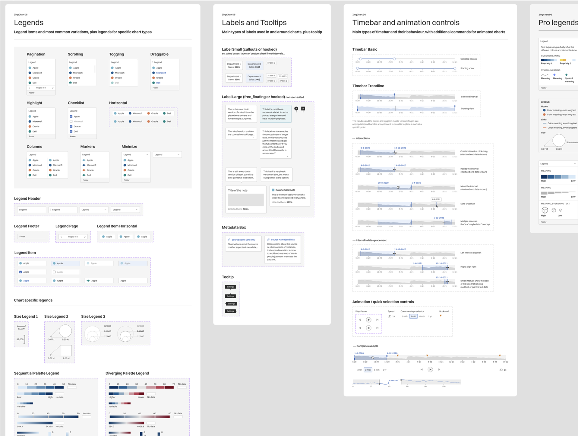
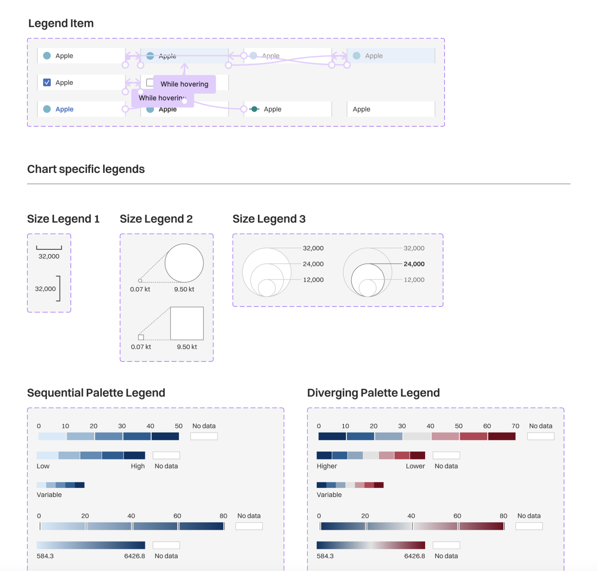
A few sections - design tokens and some data viz components - of the current design system structured in Figma.
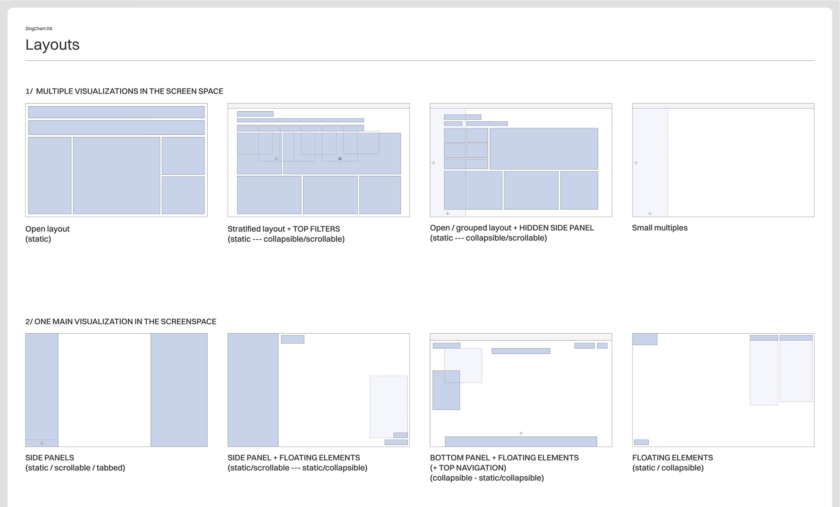
An exploration of different dashbord layouts.
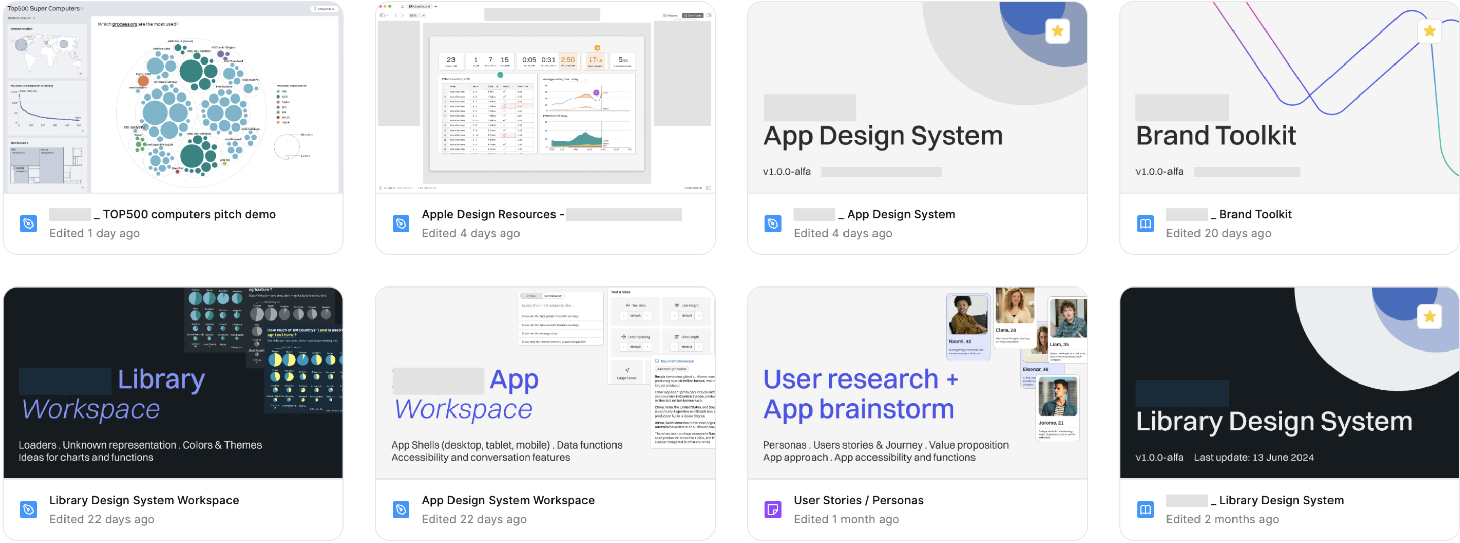
An overview of the key Figma documents developed during the collaboration; much more to come!
PERIOD
2022 - ongoing
ROLE
Lead information and product designer
TEAM
ZingSoft dev team
TYPE
Data Visualization - UX/UI - Visual ID
TOOLS
Figma - FigJam - Ae